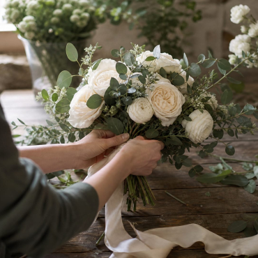
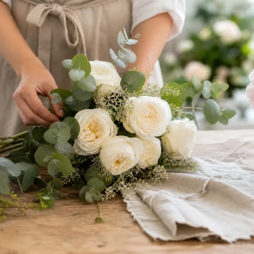
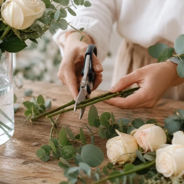
Choosing wedding flowers by colour scheme involves far more than matching a hex code to a petal. After twenty years designing weddings across Dublin, Meath, Kildare and Wicklow, I’ve learned that colour is a living thing. It shifts with light, texture and season. Your vision deserves a florist who treats your palette as a conversation, not a checklist. We work together so that every stem, from your bridal bouquet to the table centrepieces, feels chosen on purpose for your celebration.
Understanding Your Wedding Colour Palette Beyond Paint Swatches
A digital mood board is a lovely place to start, but it can’t tell you how light behaves against organic materials in an Irish venue. Screens vary too much in calibration to trust for this. I always want to see the real colour under real light before we commit to anything. When you bring fabric swatches to our consultation, we hold them up in natural light and watch how the weave takes or throws back colour. That’s how your bouquet ends up matching your dress instead of quietly fighting it.
Why Fabric and Lighting Change Floral Perception
Silk bridesmaid dresses reflect light differently than a matte paper swatch, and that changes how the flowers beside them look, in photographs and to the eye, all day long. A dusty blue chiffon might read as grey in morning light and shift to lavender under evening uplighting. The flowers next to it need enough tonal depth to hold their own, or they’ll look muddy by the time the dancing starts. I review the actual textile at our meeting for exactly this reason: it’s the only way to avoid blooms that wash out or clash against attire you’ve chosen carefully.
Translating Digital Inspiration to Real Seasonal Blooms
Pinterest images often show imported stems, or they’re edited heavily, so they don’t always reflect what’s genuinely growing in Ireland during your wedding month. Translating them means reading the tone and texture behind the image rather than chasing an exact variety that may not be possible to source sustainably. We aim for the feeling of your inspiration, using flowers that are actually available, so your palette stays true to itself and to the season and your budget.
Ruta’s Process for Matching Bouquets to Colour Schemes
Over the past two decades I’ve built my own way of doing this: physical fabric swatches, tested under natural light, checked against your dress before a single stem gets ordered. It goes further than a colour wheel, because sheen, scale and petal density all behave differently against your particular fabric and venue. You deserve a process that’s collaborative, one where we refine things together until the design feels unmistakably yours.
The Initial Vision and Texture Assessment
We start by talking about the feeling you want your flowers to carry, whether that’s soft romance, structured elegance or wild garden abundance. Texture matters as much as colour here. A smooth ranunculus takes colour differently to a ruffled garden rose, even in the same shade. Looking at texture alongside colour is how your bouquet ends up matching the silhouette and weight of your dress, so the whole picture feels like one story rather than two.
Building a Bespoke Sample Arrangement
A physical sample lets you see the true depth of a colour before you commit to it, and that takes a good deal of the anxiety out of the big day. You hold the actual flowers against your actual dress fabric, in different light, and check that the tones sit well together rather than clash. It turns colour theory into something you can touch and smell, and that’s worth far more than a swatch on a screen.
Refining Tones Through Seasonal Availability
Nature doesn’t produce the same shade year-round, so we adjust as we go, choosing what’s freshest and most vibrant in your specific week. If a particular peony is fading by the time autumn arrives, we might bring in a deeper dahlia, or a silk accent, to keep the richness of your palette without losing freshness. That flexibility is what keeps your colour scheme consistent even when the season shifts underneath it.
Real Wedding Flower Colour Ideas from Irish Celebrations
Real Flowers Touch weddings show how well this works in practice, especially during Ireland’s off-season months, when mixing fresh, silk and dried stems keeps a colour palette intact even when fresh options thin out. These weddings prove that blending mediums thoughtfully creates a dimension that a single-medium arrangement often can’t manage on its own. You can browse real bridal colour examples to see how these ideas turn into finished celebrations across Leinster.
Soft Neutrals with Textural Contrast
Ivory and cream palettes can look flat without deliberate variation in shape and finish. We layer matte roses with glossy orchids and feathery dried grasses, so the arrangement holds its interest in bright ceremony light and again in a dim reception room. That contrast is what gives a neutral scheme its sophistication, rather than letting it read as merely safe.
Bold Jewel Tones Balanced with Foliage
Deep burgundy, plum and emerald make a statement, but they can overwhelm a small space if they’re not anchored properly. We balance saturated blooms with plenty of greenery and lighter filler flowers, so nothing feels heavy. The foliage gives each jewel-toned stem room to breathe and be seen on its own, while still adding to the overall richness.
Romantic Pastels Anchored by Dried Elements
Blush pinks and soft lavenders read as timeless romance, but without something to ground them they can tip into overly sweet. Dried lunaria, bleached ruscus or preserved palms add an earthy counterpoint that keeps a pastel scheme feeling grown-up rather than saccharine. This combination suits late autumn and winter weddings particularly well, when fresh pastel stems are scarce or expensive.
Seasonal Realities for Bridal Flower Colours in Ireland
Irish weather and growing cycles put real limits on what’s available at any given time, and pretending otherwise only sets couples up for disappointment or a higher bill. Can you still get your exact colour scheme if your wedding falls outside peak flower season? Yes, though it usually means bringing in high-quality silk alongside fresh stems to keep things consistent without stretching your budget. I’d rather be upfront about this from the start, so you can plan around your vision and your resources with your eyes open.
Flexibility is what keeps colour consistent across your personal flowers and your venue decor, whatever the date on the calendar. When fresh ranunculus aren’t to be had in November, a premium silk version gives you the same delicate movement and blush tone, without the risk of frost damage or scarcity pricing. I’d encourage you to explore seasonal availability options early on, so we’re building your palette on solid ground from the start.
Coordinating Venue Decor and Table Centrepieces with Your Palette
Ceremony and reception styling calls for different levels of saturation: an arrangement needs to read clearly from a distance, and it also needs to feel right sitting a few inches from a dinner plate. A deep crimson that looks stunning on an altar arch can feel oppressive up close, which is why we often work in a gradient within the same colour family rather than one flat intensity. Scaled thoughtfully, your colours carry the day rather than dominate any single moment of it.
Scaling Colour Intensity for Large Spaces
A grand venue with high ceilings needs bolder strokes and larger clusters, or the flowers get lost in the room. We put our most saturated colour at the focal points, the top table, the entrance, and soften things with more greenery and gentler tones as we move outward. That placement guides the eye through the space naturally and gives you photographic moments without every surface needing to shout at once.
Using Hire Items to Frame Floral Arrangements
Neutral metallics, glassware and wooden structures give your colours room to breathe against whatever backdrop your venue offers. A candelabra or an arch used as an anchor stops the flowers floating visually in a busy room. You can view decorative hire pieces that complement your palette and add a bit of structure that flowers on their own can’t provide.
Securing Transparent Pricing for Bespoke Colour Matching
Custom colour matching takes real sourcing and sampling work, and that’s exactly what a transparent, itemised proposal should reflect, not a vague package price. So how are bespoke colour-matching costs actually presented? After our consultation, I put together a fully itemised proposal, broken down by stem type and hire item, so you can see exactly where every euro of a bespoke colour request goes.
That clarity means you can put your budget where it’s most visible and trim back elsewhere without losing the effect you’re after. If premium garden roses would eat too much of your centrepiece budget, we might mix in standard roses with textured fillers to get a similar look for less. You can understand bespoke pricing factors to see how those trade-offs play out before you commit to a design.
Starting Your Floral Colour Journey with Confidence
Your mood board doesn’t need to be perfect, or even finished, to start this conversation. Bring your fabric scraps, your half-formed Pinterest board and your honest questions to a no-obligation chat, and we’ll work through the possibilities together. It’s a discovery session, not a sales pitch. I’d love for you to book your free colour consultation so we can talk through your vision and build a plan that feels like yours.